Web engineering case study

Portfolio Website

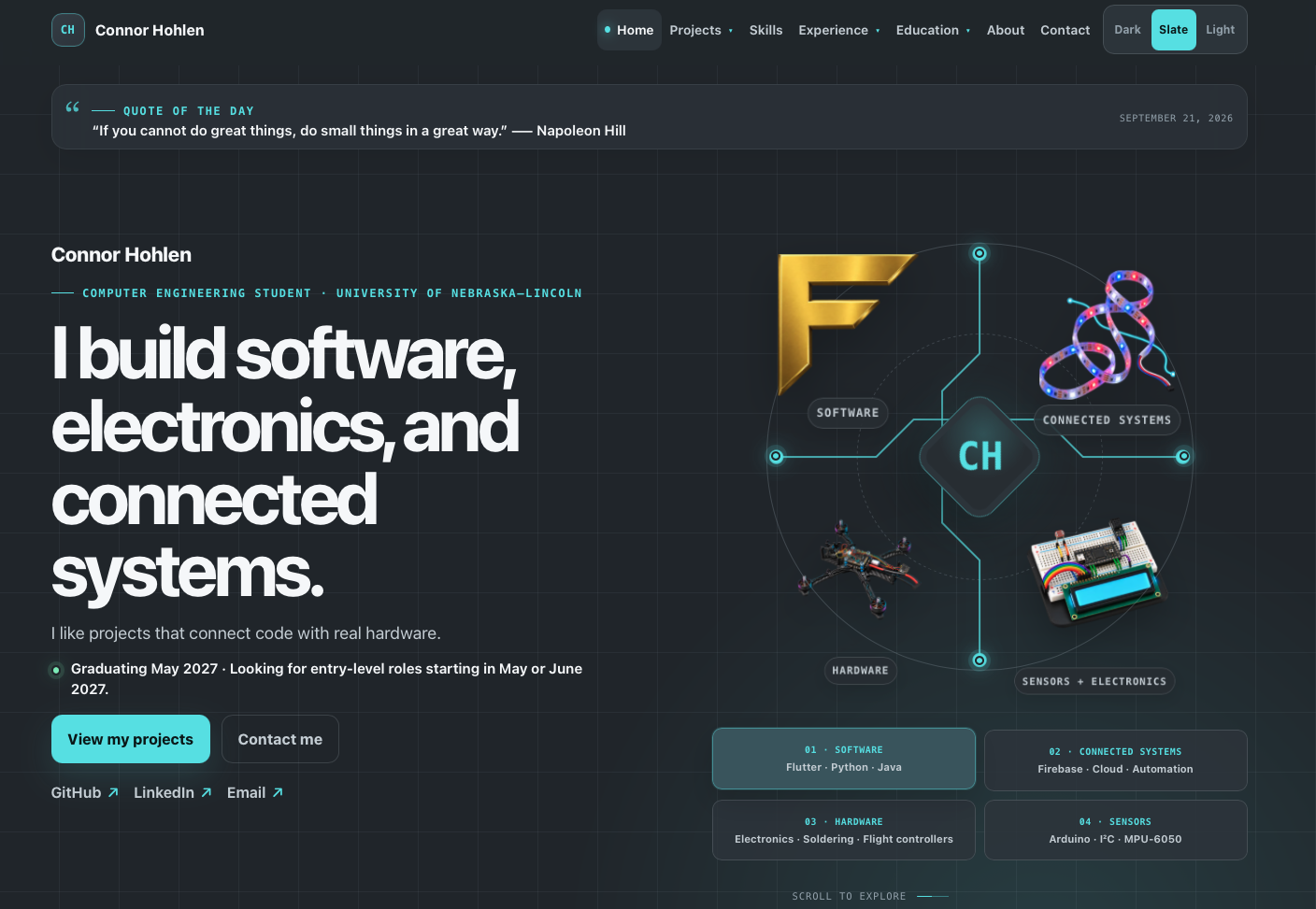
A complete redesign of a first-generation personal site into a fast, accessible, recruiter-focused engineering portfolio—without replacing its lightweight static architecture.

Status
Live + ongoing
Role
Design + development
Stack
HTML, CSS, JavaScript
Deployment
GitHub Pages
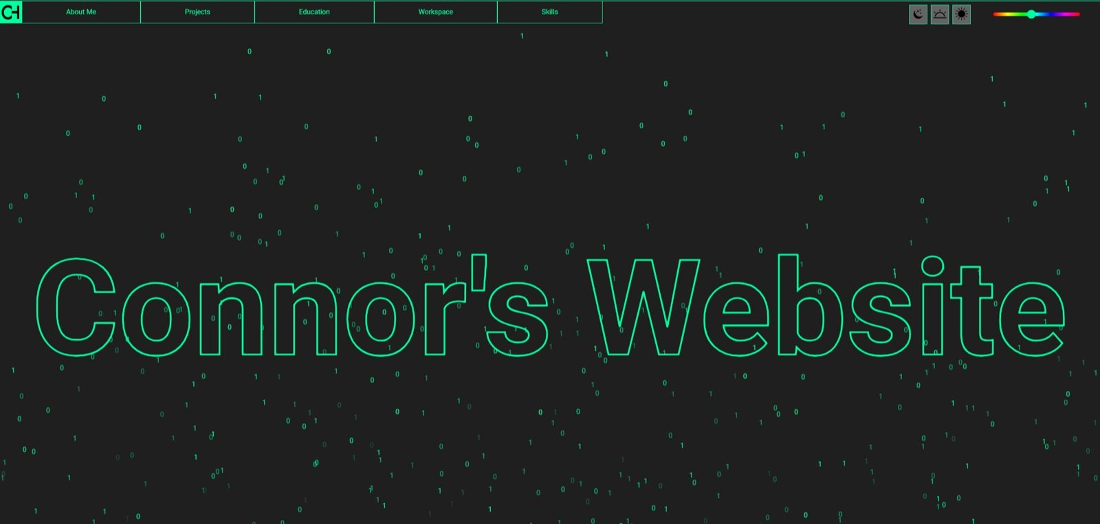
Earlier version of the portfolio homepage with a dark theme and project navigation
The first-generation site established the dark, technological personality preserved in the redesign.

Problem and motivation

The original website was an important learning project, but its content structure no longer matched the needs of an engineering job search. A click-to-enter gate delayed access, the navigation exposed unfinished projects, page layouts repeated large blocks of inline code, and professional information competed with extensive personal galleries.

The redesign needed to let a recruiter understand my degree, graduation date, technical range, experience, projects, availability, and contact options in seconds.

Goals and constraints

  • Retain the existing dark, gray, and light theme concept and technological personality.
  • Stay compatible with GitHub Pages and the custom domain.
  • Avoid frameworks, databases, and build steps that were unnecessary for a content-focused static site.
  • Preserve useful project photography while removing personal or obsolete public assets.
  • Meet practical keyboard, responsive, contrast, reduced-motion, performance, and metadata requirements.

Site architecture

Semantic pages Homepage, About, three case studies
Shared assets One design system and one behavior file
Static hosting GitHub Pages + custom domain

Each public page contains complete semantic content and metadata. Shared CSS and JavaScript handle the design system, navigation, themes, section state, and résumé preview without relying on client rendering for essential information.

Implementation

  • Replaced the blocking entrance with an immediate professional hero and reduced-motion-safe reveal effects.
  • Consolidated duplicated inline styles and scripts into shared assets using CSS custom properties and guarded JavaScript.
  • Built a sticky navigation system with a focus-managed mobile menu and scroll-aware section state.
  • Created Dark, Slate, and Light themes that use the operating-system preference on first visit and persist an explicit choice.
  • Reorganized the site around three verified case studies, experience, education, skills, a safe résumé, and a clear contact path.
  • Added canonical metadata, social sharing data, structured data, a sitemap, robots rules, and legacy URL redirects.

Major challenges and solutions

Reducing duplication without introducing a framework. Essential markup remains in each static page for resilience and SEO, while the large style and behavior layers are centralized into one CSS and one JavaScript file.

Preserving personality without preserving distraction. The redesign keeps the grid, cyan accents, dark surfaces, and subtle technical details, but removes constant motion, excessive glowing effects, novelty APIs, and generic placeholders.

Protecting privacy while keeping the résumé useful. The public résumé was rebuilt from verified professional information and excludes the previous street address and phone number.

Testing and validation

  • Validate HTML structure, metadata, headings, alt text, internal paths, and legacy redirects.
  • Check JavaScript syntax and test menu, theme, active navigation, and résumé behaviors with keyboard and touch input.
  • Test responsive layouts from 320px through large desktop widths and verify direct static URLs.
  • Inspect the résumé PDF visually and scan extracted content for private phone or street-address information.
  • Run accessibility and Lighthouse audits against the locally served site.

Result

The site now presents a clear Computer Engineering identity, prioritizes three meaningful projects, makes professional links immediately available, and uses a much smaller set of intentional assets. Every primary page shares the same responsive design system and remains deployable as plain static files.

The portfolio is designed to evolve: project screenshots and verified outcomes can be added without changing the overall information architecture.

Lessons learned

  • Clear content hierarchy often improves credibility more than adding new visual effects.
  • Accessibility requirements are easier to satisfy when they shape components from the beginning.
  • Static sites can remain highly polished without a large runtime or framework.
  • Privacy review belongs in the same workflow as content, performance, and visual QA.